It’s hard to justify Tahoe icons
229 points by ehamberg
229 points by ehamberg
Questionable design decisions and HIG divergence puts app developers like me in an awkward spot. There are always users in three groups: (1) HIG is doctrine (2) matching built-in apps is doctrine and (3) my opinion is doctrine (and I suppose the bonus group that doesn't care but you don't hear from them).
When the HIG is bad and especially when the HIG is bad and built-in apps are not following it, it causes all three groups to swarm the 3rd party developers. So then, I have to make a judgment call, and then defend that judgement call against all angles. It's annoying, and a lot of the time I just want to move with the crowd and don't care to defend this thing.
This is made even worse when there isn't a nice on-ramp onto newer decisions. For example, macOS 26 provides no 26-only API for setting menu icons, so the first time I did it (to match other built-in apps), it also set icons for macOS 15 which looked very wrong and didn't match built-in apps! So I had to write my own helper that gates on runtime version. Stupid. Waste of time. Shouldn't be my job.
Or, if you provide a macOS 26 app icon (squircle), you can't simultaneously provide a macOS 15- style icon. Instead, earlier macOS versions use squircles that look out of place. There used to be a workaround, but Apple plugged it in the 26.1 SDKs! AhhhHH!
I'm busy enough making my app work. Burdening me with these decisions that I honestly most of the time simply don't care about is super frustrating. This isn't targeted only at Apple, but all platform providers. Apple has been particularly bad recently though when they were previously a shining light.
(1) HIG is doctrine (2) matching built-in apps is doctrine and (3) my opinion is doctrine
I'm probably in the third group. There are a few things in the HIGs that haven't been updated for ages and don't make so much sense anymore, but ever since the skeuomorphic push I've been very much opposed to the second opinion.
The SwiftUI / Catalyst push also made this worse. I really like the NeXT model of floating inspectors that let me lay out my workspace in a way that's convenient for me, but all of these things have gradually been moved into docked bits of the UI so that apps can work nicely on the iPad as well as the Mac for a bunch of third-party things. Where normally I'd have had the main document, then the most commonly used panels, then the things I'm referencing, then panels I either want to just look at not click on, or where I want to click on them frequently, now all of those bits of the app are closer to the document than the reference material. And that makes working on a big screen much more annoying. It's fine on a tablet, because I'd run each app full screen and switch between them quickly, but I do that as a compromise because the tablet being small for portability is more of a benefit than it having a big screen.
I think that floating secondary windows (inspectors, toolbars, palettes) have fallen out of favor pretty much industry-wide. Many graphics tools that used to use the “document plus floating panels” model now just use a single window, as do the IDEs, video editors, and audio tools I can think of. On Windows, the Multiple Document Interface (child windows inside a parent window) used to be far more common in the past too.
MDI on Windows was the worst of both worlds. You had the floating-panel thing that may lead to clutter, but you also had the outer window occluding anything behind it. MDI with anything other than a completely full outer window was a waste of screen real estate. Most MDI things were thing that were trying to copy MacOS (which is somewhat MDI-like because the menu bar is at the top of the screen rather than in a single window, for Fitts' Law reasons).
Oh, I certainly agree that MDI was misguided! That said, it feels like both MDI and floating tool windows on the Mac started becoming unfashionable around the same time. Perhaps it just has to do with laptops becoming more common than desktops with big monitors.
MDI was actively discouraged in the late '90s. I recall Windows documentation that came with Windows 2000 telling you basically 'don't use MDI in new apps, we made a mistake and we'll keep supporting it for third-party things, but don't add to the problem'.
Questionable user interface decisions like this have become an endemic problem in the industry, unfortunately. I first began noticing this trend on the web. More and more web-based services have been replacing text with icons, often poorly chosen ones. And some of these icons are so simple and abstract that it is hard to tell what they even mean!
For example, the default Gmail web interface once had simple text buttons with options like "Archive", "Report spam", "Delete" and so on. Now it has tiny icons instead. While the bin icon is probably obvious to everyone (it means "Delete"), there is an icon with a tiny down arrow in a tiny box that I would normally guess means "Download", but it turns out it is "Archive" instead. There is another icon with a tiny right arrow in a tiny box. I would normally guess that means "Forward", but it turns out it is "Move to". (Move to what? Move to a label!)
GitHub eventually adopted this trend too. It had very clear and obvious text navigation links before. Now we find little icons instead. One of them is an irregular but symmetrical hexagon with three line segments inside it. Can you guess what it is? It turns out to be a badly drawn envelope that means "Notifications". There is another one that is just a little dot inside a circle. Until I hovered over it to read its tooltip, I had no idea that it meant "Issues"! With trends like this, I worry that mastery and craftsmanship are losing the value they once held.
There is another icon with a tiny right arrow in a tiny box. I would normally guess that means "Forward", but it turns out it is "Move to".
I recently had to look up how to use text labels for these buttons. They don't make this setting easy to find!
I like icons in menu, they allow for faster lookups (for me personally). But I totally agree with Niki, icons consistency should be in macos.
It is explicitly covered in the article. When some icons are present for the most important actions, it helps a lot. When all items have icons…. That just doesn’t (at least for the author and me too).
Honestly, I'd even be okay with all menu items having icons, if I could bloody tell them apart from each other. But they're all miniature monochrome squiggles, like hieroglyphs for hamsters. At this point they're just visual noise next to the menu items, you can't actually use them to recognise anything.
I know the common way to do it was to use icons for emphasis, although I suspect that might just be a retroactive explanation (I have a very dim recollection that the items with icons were the ones that you could also add to the toolbar -- but don't quote me on that, this was forever ago). But there are functional counterexamples as well. "Old style" Windows Start Menu had icons basically everywhere and it was okay. Icons were pretty helpful, too, as they mapped to entry classes -- they either had a "subsection" icon, or the icon of the file type/application it shown.
I really don't get this aversion to color in all UIs. I mean, yes, I get its purpose on mobile apps -- the whole point is for people to stay focused on the timeline so additional stimuli have to be avoided at all costs, plus there's only space for three or for of those anyway. But why would anyone subject people with 30" screens to this stream of a dozen dark-grey-on-light-grey squiggles? What is the list of requirements that people can plausibly look at, then look at these icons, and say yep, this is EXACTLY what we're looking for!?
Is there a recommended modern day, non mac specific, equivalent to those "Macintosh Human Interface Guidelines" linked at the beginning of the article?
There are KDE and Gnome HIGs and of course they don't agree on a lot of things https://developer.gnome.org/hig/ https://develop.kde.org/hig/
Did you even read the guidelines? the UI principles are generic enough to be applicable to almost any interface.
Right, based on the quotes from the post I noticed they are general purpose enough and that's what prompted me to want to read something like that. But that's a doc from 1992 so I'm guessing there's been some evolution of the conventional knowledge in that field?
The biggest thing that's changed from the research back then is that you shouldn't localise button order.
Back in 1992, the recommendation was that the 'go back' action should be on the left and the 'proceed' action on the right in dialogs in LTR reading order countries, but the other way around in RTL locales. It turns out (research from about 20 years ago) that the human perception that left is back and right is forward is not linked to reading order, so you don't need to flip the buttons in RTL locales. I can't remember if Apple fixed that in newer HIGs (and don't know if they fixed it in Cocoa: OpenStep was designed to express the abstract order so that these could be reordered based on locale).
Things like Fitts' Law as a motivation are still valid. Touch screens change the calculations slightly, but not much. The easiest areas to reach on a hand-held touchscreen are the locus of the thumb when held normally (which is more likely to vary between left and right handed people than by locale, so should be switchable if it isn't symmetric), rather than equally on all edges of the screen.
One of the things I really liked about the early HIGs was that they included justifications for everything, based on HCI research. The KDE and GNOME ones rarely did and were mostly 'I grew up with systems that did this stupid thing so I think it's natural and everyone should do it', with some occasional good bits where they'd copied good systems.
Gnome and KDE are some of my favourite offenders in terms of cargo culting (including Fitts' law, but that's a whole other story). Years ago, when GTK introduced that dreadful text dimming for inactive windows, it was driving me nuts and I couldn't quite put my finger on WHY until someone showed me the exact same feature on a Mac. Switching away from, say, a Finder window, would "dim" the text on the buttons, the sidebar and so on, but leave the main view alone (I don't remember if literally or it just barey altered its colours). Switching away from a Files window, on the other hand, would fully dim all the text, including the text in the files view, file names and all -- so as a side-effect of not wasting your focus on inactive windows, it also made it much more difficult to do things like cross-reference things between an active and an inactive window.
I think it's not even a form-over-function thing, half the time I get the feeling that whoever's copying the form doesn't fully understand the function -- so they copy the form, and then retroactively justify it with the function on the other system, even when it doesn't apply 1:1.
Apple still maintains the HIG document (somewhere on the web, behind a graveyard of broken links from endless rewrites of their dev site with more and more gratuitous JS), and they mostly keep it up to date with whatever they're doing (even when their own products don't live up to their own standards).
Try to find a copy of HIG from whichever version you think Mac OS X has peaked at. It used to be bundled with Xcode's documentation, so it will be on a second CD/DVD from boxed releases. It used to be really really good.
I don't know why we're focusing on the menu icons here, when the entire UI is now an unusable pit of useless transparency, and the grotesque overuse of transparency for the sole purpose of demoware means that the basic functionality of the menus is completely broken. If anything the overuse of icons is actually beneficial as it provides some additional contrast in the menus to distinguish the menu text that is now being blended with the underlying text.
The Genie effect was the start of this.
It was added in OS X 10.0 because it provided a visual cue about where minimised windows ended up. If you turn it off, people have to notice a small window appearing somewhere else, and that is much worse for usability.
But Apple did some studies that found that showing the Genie effect in in-store demos led to higher sales rates. After that, everything in the UI had a dual mission: improve usability and drive sales. Things like Exposé or the cube effect for user switching looked amazing in demos, but also improved usability. Over time, it appears that they forgot about the first mission.
The other inflection point was probably glossy screens. Apple had two datapoints: user feedback from people who had bought matte displays was more positive, but the glossy screens looked brighter in brightly lit shops and so sold better. They made matte a build-to-order option, with glossy the default, because the worse one sold better.
He is complaining about distracting icons on a website with a distracting snow animation making the text hard to read.
Yeah, because a personal website should be held to the same standard as a multi-million user operating system that serves as a productivity foundation for many people. What a shitty comment tbh. Is this the orange site?
Sure, they don't have to be held to the same standard. But is it really too much to ask to not have stuff drifting around the page while trying to read an article? Am I crazy here?
It's a personal page, I think some uniqueness (that is toggleable) is fine?
It's toggleable if you figure out that the snowflake icon, which is unlabelled and shows no signs of being interactive (not even a highlight on hover like the icons beside it), is what toggles it. This is its HTML: <div class="winter"></div>. I honestly feel bad for people with low vision (which will probably include me in the future) who will have to look at this kind of stuff. Sure, it's a personal page, but does that mean that a11y suddenly flies out the window?
Sure, it's a personal page, but does that mean that a11y suddenly flies out the window?
At least Firefox's reader mode works well on tonsky's blog (I wish it was more common!) I haven't a particularly bad vision, but I have to use it everytime I want to read one of his articles because otherwise the yellow background absolutely kills my eyes.
Well, it works OK. I initially read it in reader mode, but when I tried it without to see how horrible it would be, I noticed that it had missed the “Confusing metaphors” heading. I just dug into this and it turns out it's because the <h1> element in question has an id with “meta” in it.
After seeing this I can only conclude that reader mode is a massive hack, and people should be aiming to make their sites readable without the browser having to guess which are the good parts.
Ha, thanks. Not one of the lucky few sites then.
Yes, it is kind of a hack and it's frustrating exactly for that reason: you never know if you're going to read the entire text or not. Sometimes it's even entire paragraphs that are missing. What's funny is that Pocket's reader mode was also kind of hack, but with different results. While Pocket and Firefox were under the same umbrella, they never merged their parsers together, apparently.
Of course it is! It's a personal website. A hobby. An escape from that toughness of life. Losen up. Life is too short for taking a personal website that seriously. No one is claiming it doesn't affect readability. But it's just a website some guy runs on the web.
Thanks for the concern, but I assure you I am plenty loose. I just closed the tab and moved on 🤷♂️
Well, before moving on, you also asked if it was "too much to ask" for Tonsky's personal website to fall in line with your personal standards. So now you have your answer.
My personal standards like...checks notes...not having stuff randomly fall across the screen while I'm reading an article. Man, people are weird. I often don't appreciate how weird.
I just closed the tab and moved on
Meanwhile, we’re still waiting for this to happen, so… you’re weird too, loosey goosey.
People on here be like: we will keep pinging you to check whether you've closed this tab. Also, reading the ping will bring you back to this tab.
🤷♂️
I don't think “I can't read this” is an unreasonable complaint? Maybe your reading isn't as easily disrupted as mine, but to me the article looks closer to n-gate's about page than anything intended to be read. If people were having this experience with something I made I would want to know.
The blog post could be presented as light gray text on a white background and its presentation still wouldn't devalue its information. I think the snowflake animation gave it a personal touch, which is a welcome distraction to the usual boring corporate design, or let alone, AI slop that you see everywhere. Also, it's easy to disable the animation, even in Firefox, and the author is known to have a gimmicky website (see the dark mode toggle).
Edit: Added the word "design".
or Apple's design got so bad that even someone with a Geocities-style blog can see how bad it is.
reader view is our friend, no need to make it personal. if only reader view existed for macos menus
Also add that they replace the default icon cursor. I'm one that changes the cursor for usability.
It is possible to disable it by clicking at the snowflake icon, but yes, quite distracting
This only worked intermittently for me on firefox - if I scroll down, get annoyed by snowflakes, scroll back up and click the icon, the background changes to yellow and snowflakes continue.
Baffling. Blogs about usability and UI, and yet the default style is annoying at a minimum and buggy & impossible to disable at worst.
I thought that initially, but realised clicking the button disables the generation of snowflakes, but keeps the ones on the screen until they've drifted away. So as long as the background is yellow, you'll eventually (~2s) be done with the snowflakes.
That said, I found the effect cute, if unnecessary, and thought the content of the blog more than made up for the author's aesthetic foibles.
if you do that the background becomes YELLOW.
it's funny, i agree with most of his UI takes so his blog being atrocious is so ironic
You can turn it off. There's a button for it on the top right.
There's also a dark mode button there, which I hate but is a hilarious shitpost.
I can't help but note that when you toggle "dark mode" (which hides the entire screen), the button to disable it is still kept visible.
What's really amazing (to me) is that despite people having been complaining about usability of Apple systems for more than two decades now (example), the company is still held by its fans as some Paragon of Design. I don't know, may be it was that at the very beginning, but really, how many more examples do we need to stop pretending it to be the case?
Apple has been getting worse at a slower rate than most of its competitors.
I can't think of a single modern system that is better for core usability than MacOS 9 or OPENSTEP 4.2. They're better in a bunch of other ways (neither of those systems had spell checking as you type in the default text views, for example, and neither had a compositing display system so required redraws for all window movement), but UI regressions have outweighed improvements in almost ever edition of successor systems.
Windows started from a pretty bad place and got worse. Open source DEs copied Windows and then made it worse. Android seems to be just trolling in terms of UI design.
I would say that not crashing constantly is a usability improvement.
OPENSTEP 4.2 didn't crash very often, probably no more than modern macOS. MacOS 9 did, due to the lack of memory protection between the kernel and userspace, but that was something that would have been possible to retrofit (the existence of the Classic compatibility layer on OS X demonstrates this: it preserved the same userspace / binary compatibility on a completely different kernel).
A/UX also sandboxed Classic Mac applications, back on the 68040. A crashing Mac program could take down all of your Mac programs, but none of your Unix programs.
That shows just how much Apple was ahead in their better years, to still be the best* despite being so much worse than they were before.
* of the big platforms
Even Don Norman told it decades ago: Apple has scarified usability for prettinessI.
Apple is not easy to use if you have no prior exposure with Apple. And I’ve witnessed that with Apple newcomers. It’s really hard.
But: 1) it is pretty and 2) people are convinced that it is easy so they are putting the extra effort to not appear dumb.
The opposite is true for Linux: most people approach it with the "it must be really hard" mindset.
usability
easy to use if you have no prior exposure
These two are not the same. Something can be both lot to learn and very usable and vice versa. I’d argue Mac is very usable, iPad is easy to learn. They serve different purposes for different kinds of people.
95% agree, but there's a nuance:
All this being said, I gotta give Apple credit where credit is due. When they are good at choosing metaphors, they are good:
[picture of "up/down/back/forward" menu items with directional arrows]
Using left and right arrow icons for back and forward can become incorrect depending on the context and locale. If you're in a right-to-left culture and back and forward do not switch from left and right to right and left, they point the opposite way of what the button will do. Bonus points if your computer is set to a RTL language but you are editing LTR text - what is the right thing to do here? Nontrivial. (Maybe Apple gets this right! I have no device to test it. Sharing a general tip.)
This is not actually true. It was widely repeated in the '90s, but then someone bothered to do the research in the early 2000s and it turns out that native readers of RTL languages still think right means forward and left means backwards in other contexts. There was some follow-on research that was inconclusive but suggested that left-handed people might have a natural predisposition to think the other way around, but are exposed to enough cultural cues in early life that it's a less strong correlation for them.
Great to hear that! I've been propagating this after... Spotify? Netflix? posted about how they reverse the order of elements and arrows in a horizontal carousel
I'm left handed, and I think being so led to me being directionally dyslectic. I'll often say "turn right" while motioning to the left with my left (dominant) hand. And while rare, I do mix up east and west.
It feels like the person tasked with choosing a unique icon for every menu item..
Hold up, are we even sure there was a person involved in choosing them, or were they all chosen by Apple Intelligence? :D
I agree, some aspects of Tahoe are bad, including both menu and app icons. But they’re not half as bad as fricking snow falling on a website without a toggle to turn it off, heating both my iPad and temper.
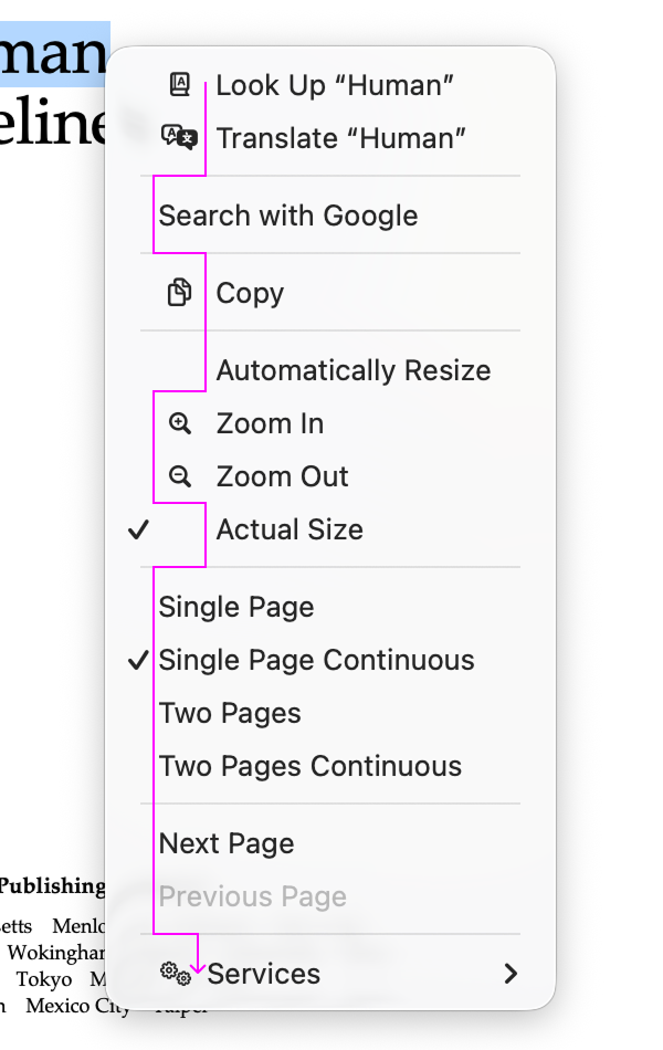
In https://tonsky.me/blog/tahoe-icons/align_tahoe@2x.webp?t=1767625715, I'm not sure why the purple line goes left for Zoom In and Zoom Out. Shouldn't it continue straight down so that the icons are on the left side of the line?
At this point about the only way to remain an Apple fan is as a historian or a stockholder. Despite many or even most of their products' components being really impressive to this day, it's hard to say that about many of their products top-to-bottom besides maybe AirPods. They were always controlling, but that control was foremost for the sake of output, not income.
MacOS has really fallen off lately, especially with the need for an icloud account. You have to bypass the bootloader security.