Accessibility in GNOME
19 points by FedericoSchonborn
19 points by FedericoSchonborn
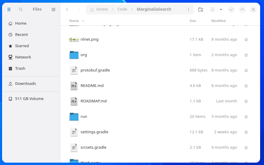
Nice talk, but it's weird, I decided to give GNOME a shot the other day and what really struck me out of the box was how inaccessible it is. You have miniscule click targets that you need to mouse over to discover, what looks like a button when you mouse it over sometimes is a vi-style modality switch for the entire window, sometimes a button, sometimes a menu. Abstract monochrome lineart icons without labels, window focus that's conveyed by giving the window contrast issues. Like all of these things are problems if you have sight issues.
https://www.marginalia.nu/junk/gnome.png
My favorite is this:
https://www.marginalia.nu/junk/gnome2.png
That is one button. I'm not saying that one out of the three icons is a button, no all three icons are in defiance of every UI design convention collectively one button, lika a clickable dugtrio. You're expected to methodically hover over every element on the screen to discover if it's clickable or not. Then you click it to discover what sort of clickable element it is. The results will more often than not surprise you. Feels like you're playing a Sierra point & click. Just try random things and hope to chance on the moon logic that gets you forward.
It's like the the entire design philosophy of GNOME is to use as little screen space as possible for some reason. It's like a fractal of ambiguous design driven by minimalist aesthetics above usability and accessibility. Most of these issues weren't issues in GNOME 2.0.