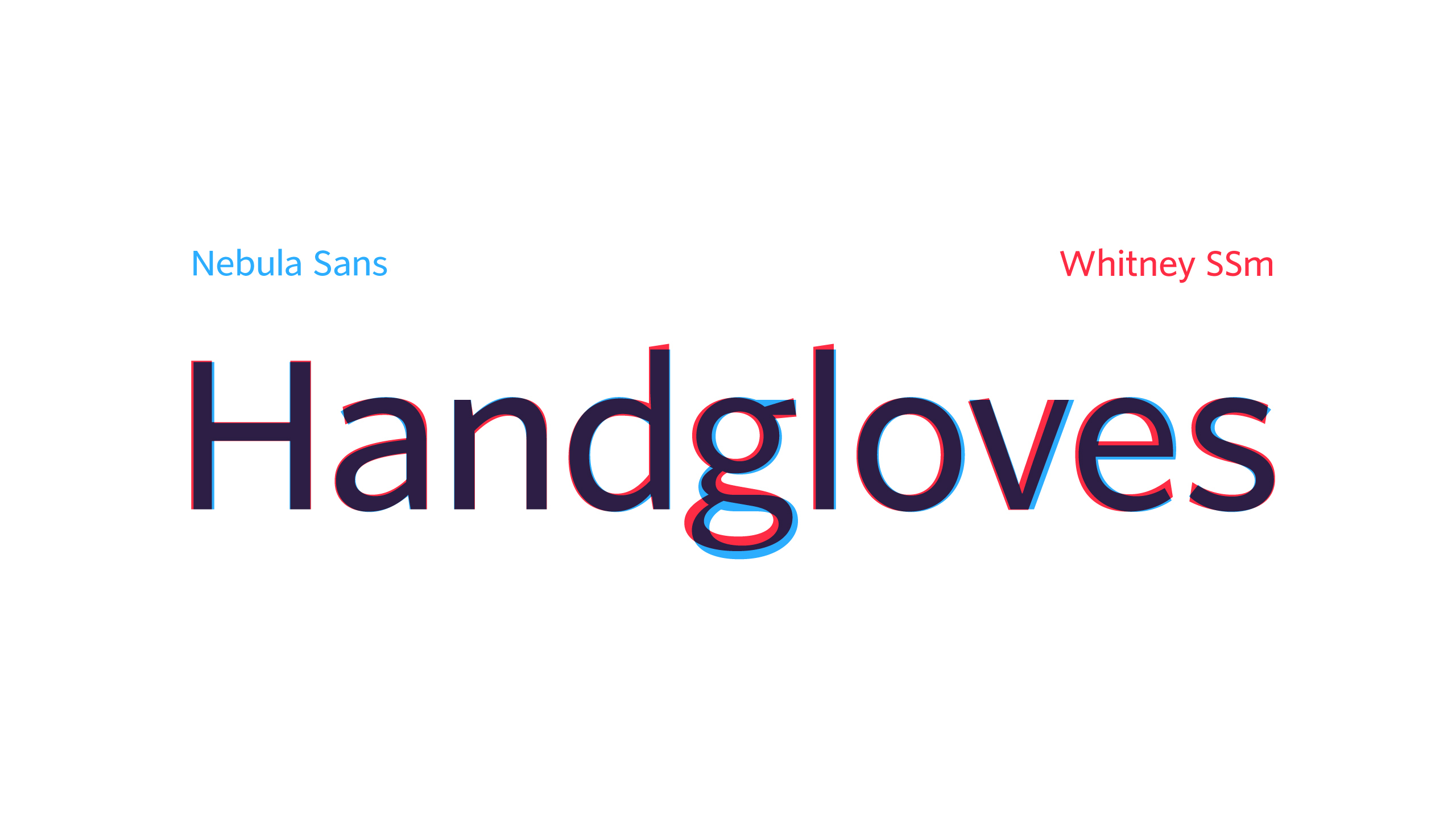
Nebula Sans
15 points by technetium
15 points by technetium
This is a fork of the open-source Source Sans 3, lightly edited for metric compatibility with the commercial Whitney SSm, and with a small number of other changes. I think the main real change is removing the tail on l to match Whitney (you can get it back from ss03). But other than that, the letterforms are definitely Source Sans.
https://nebulasans.com/img/handgloves.png compares Nebula Sans with Whitney SSm.
A better comparison is with Source Sans 3. When the font was discussed last year on HN, someone made that comparison, which makes it really obvious that it’s just metrically-adjusted Source Sans, plus that l change (regression, I’ll call it).
I feel the project is presented as a greater accomplishment and novelty than it really is. Unless you specifically want metric compatibility with Whitney, use Source Sans.
(I presume this was submitted now due to being on HN again.)
I’m gonna need Sam From Wendover Monospace now.