Justifying text-wrap: pretty
18 points by vulcan
18 points by vulcan
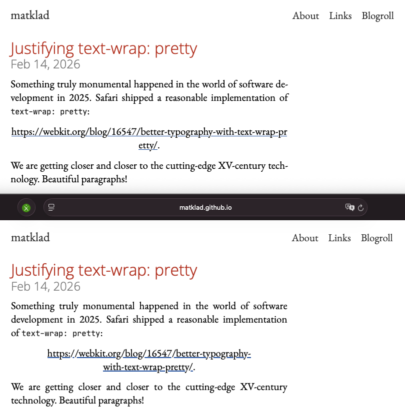
Nothing against the article, but opening it up and seeing that abomination of a link (in LibreWolf) made me chuckle.
Safari for comparison below: https://stuff.art-core.org/2026/pretty.png
And yeah, for all the "I like this font" I have said in the past, I guess in the end I can't say I care enough about typography. Would be cool, but I've lost any hope and as long as it doesn't look completely horrible to me, I'm fine. (But I might play around with these justify settings on my blog).